Hi, I’m Norin!
Multi-Media Artist & Designer
Interested in gaining hands-on experience in typography, print media and community-focused design
This animation introduces the University of Georgia’s 2026 BFA Exhibition showcase for Graphic Design. Each designer was prompted to solve a hyperlocal problem; hence, the exploration of Athens' specificity through our identity.
The exhibition's therefore become ‘DIAL(706)’, with 706 representing the caller ID for the city of Athens, Georgia.*photographs taken by Remi Rosal
DIAL (706) Exhibition Opening
Brand Identity | Adobe Premiere Pro |
Photo Treatment
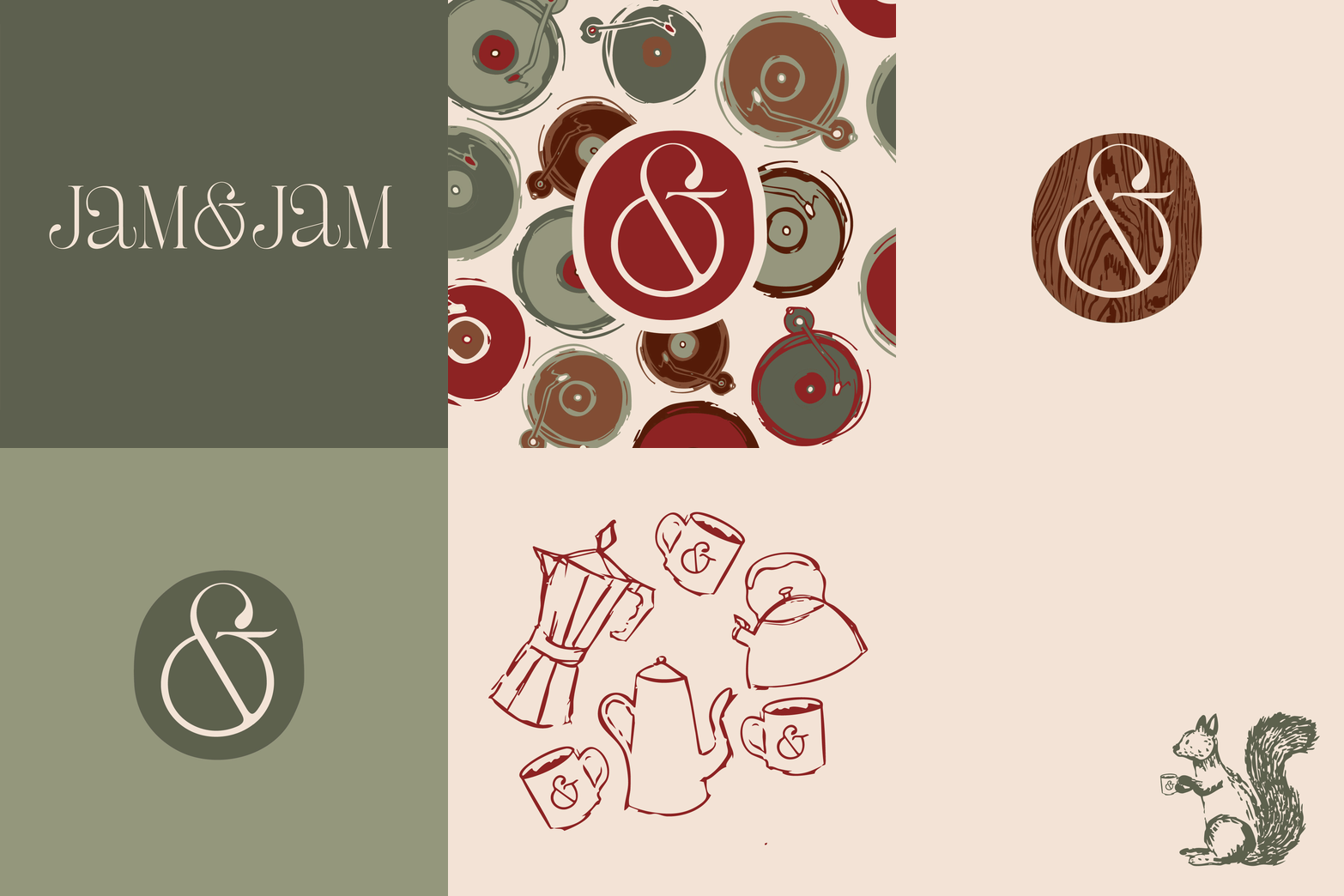
This identity captures the sophistication of this dual cafe & record store, while also evoking an inviting, retro vibe through the use of a flowing, rounded, refined serif, alongside playful illustrations. As a business, their primary goals are to welcome and to sustain, captured by their naturalistic color scheme of muted greens and browns and simplistic typography.
Jam & Jam
Brand Identity | Illustration
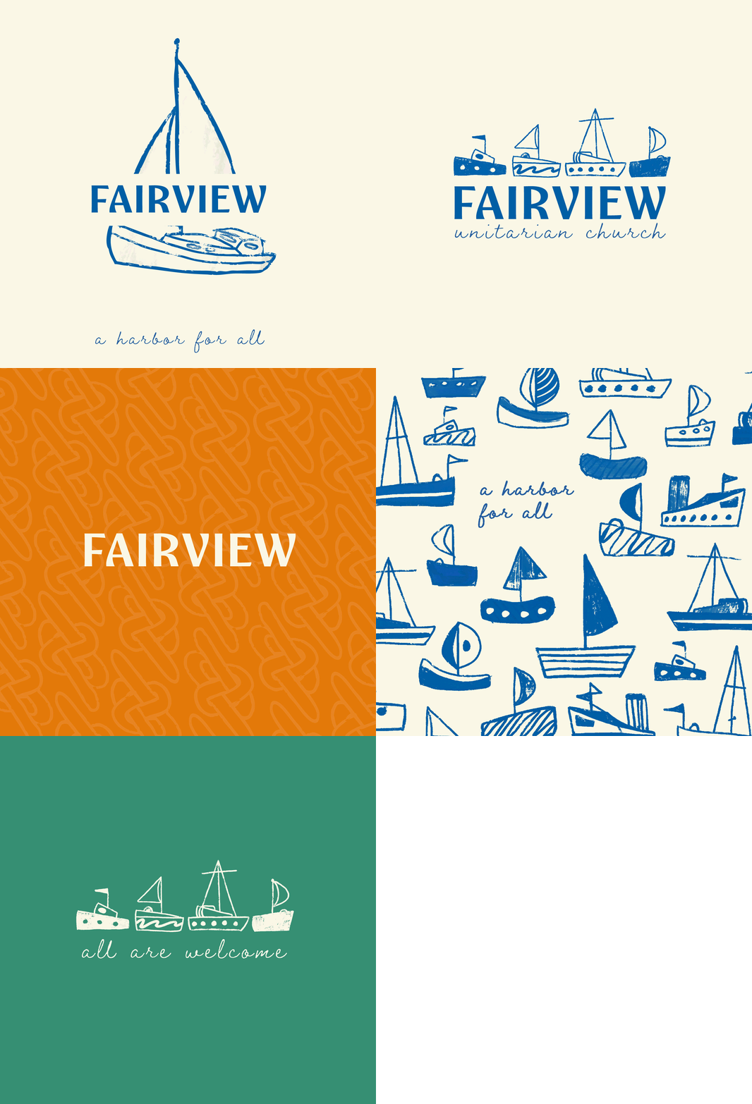
For a church well known for its seaside views and beachfront services, Fairview Unitarian Church is a harbor for all. Their church a place where all are welcome and all are accepted. With its flowing typography and coastal blues, this identity welcomes any visitor into a space of growth for anyone seeking a place to dock.
Fairview Unitarian Church
Brand Identity | Illustration
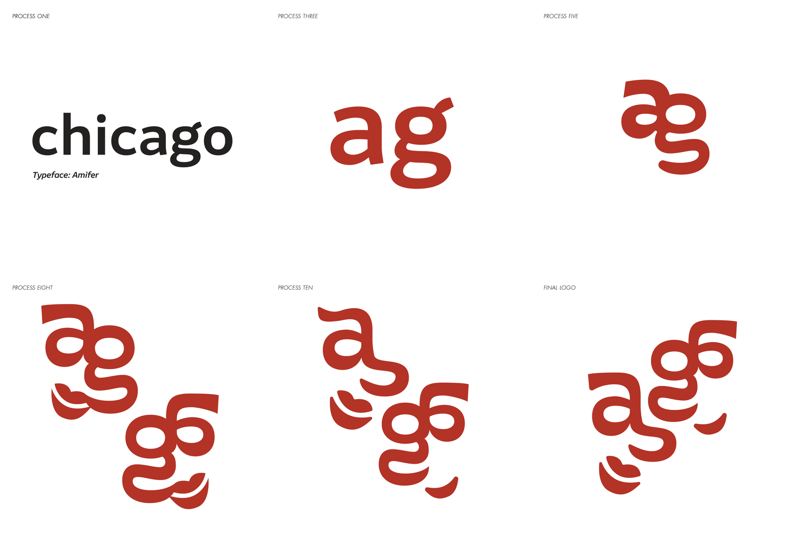
For this project, we were asked to redesign a large, well-known festival. After researching and talking with Chicago’s Department of Cultural Affairs and Special Events, I began curating a more welcoming, community focused brand identity for the Taste of Chicago; centering on the diversity within the culinary vendors, different cultural representations, and the stories being told through their dishes.
Taste of Chicago Rebrand
Brand Identity | Environmental Design
View More Work!
View More Work!

This high-end restaurant combines the luxury of fine dining, with the quaint references to traditional icelandic and japanese dishes. With multiple locations across the southeast, they needed one primary logomark - but also ways to uniquely showcase each location. With a specialization in molecular gastronomy, they prioritize the combination of flavors seamlessly; hence all of their locations come together as one to form Brago.
Brago
Brand Identity | Illustration
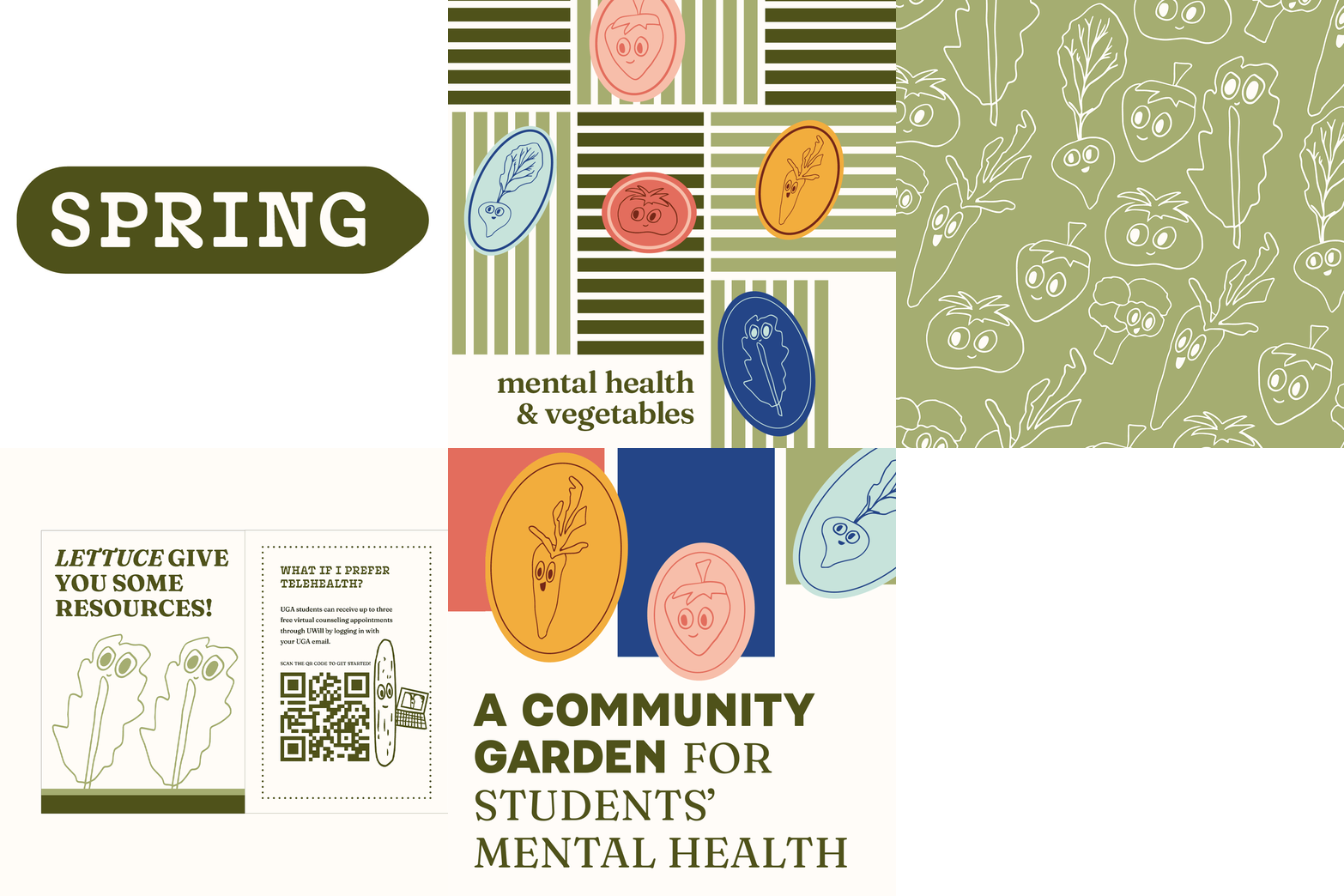
For my BFA Capstone Project, we were tasked with solving a hyperlocal problem. I chose to look further into the lack of accessibility for mental healthcare for UGA Students. SPRING shows a positive, community-focused branding to provide useful resources to students in need.
SPRING
Brand Identity | Illustration