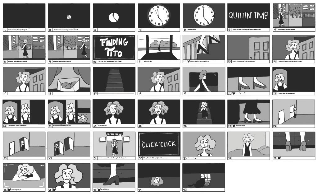
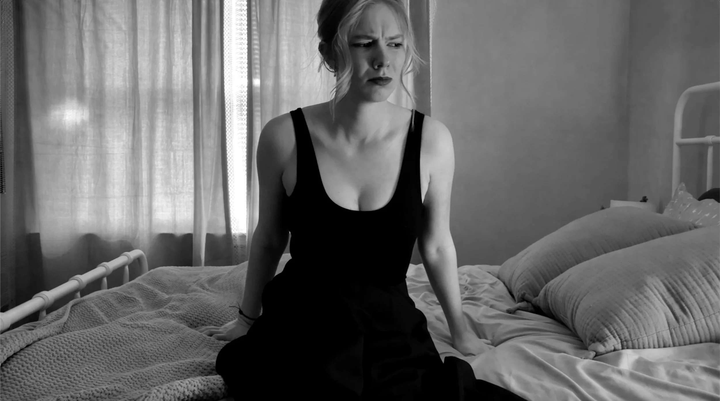
Tito is my very vocal cat. He consistently greets me with purrs, and meows, and I began to wonder, what if Tito wasn’t as vocal as he was? What if he didn’t greet me at the door when I arrived home?
To illustrate this idea, I explored the concept of silent films. I dove deep into what makes the genre distinctive, and how to properly recreate the comedy and fast-paced timing of these films.
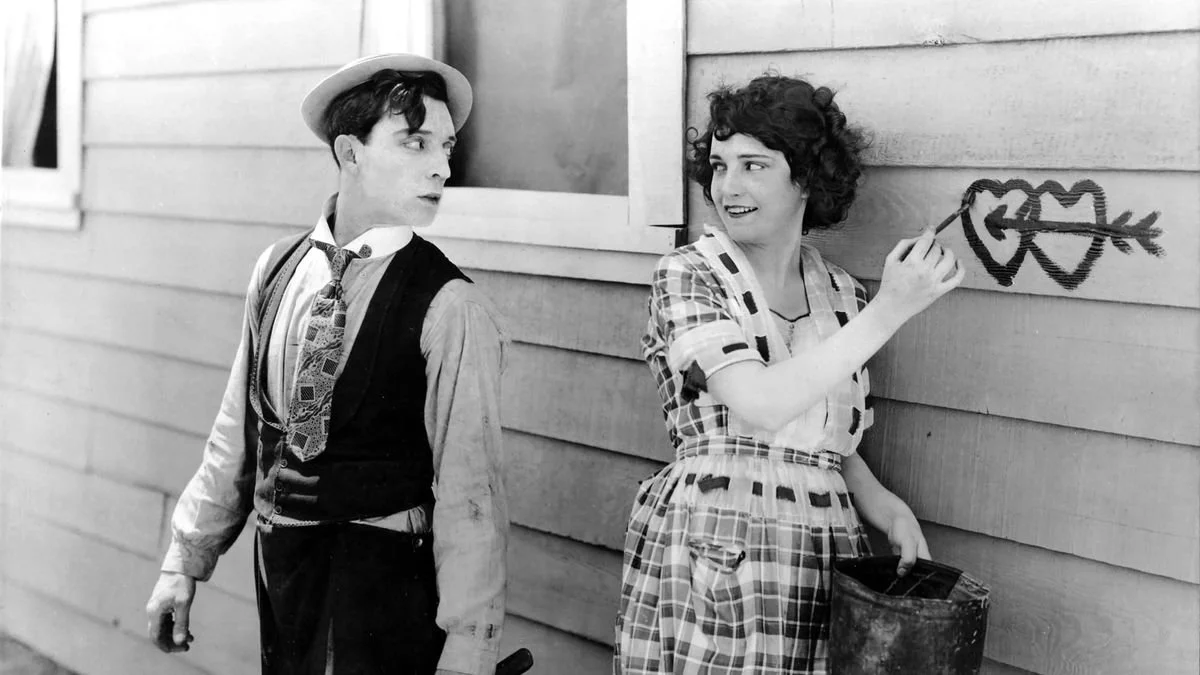
celebrating the silent film genre
dramatic facial expressions
audio changes that correspond with a facial expression change.
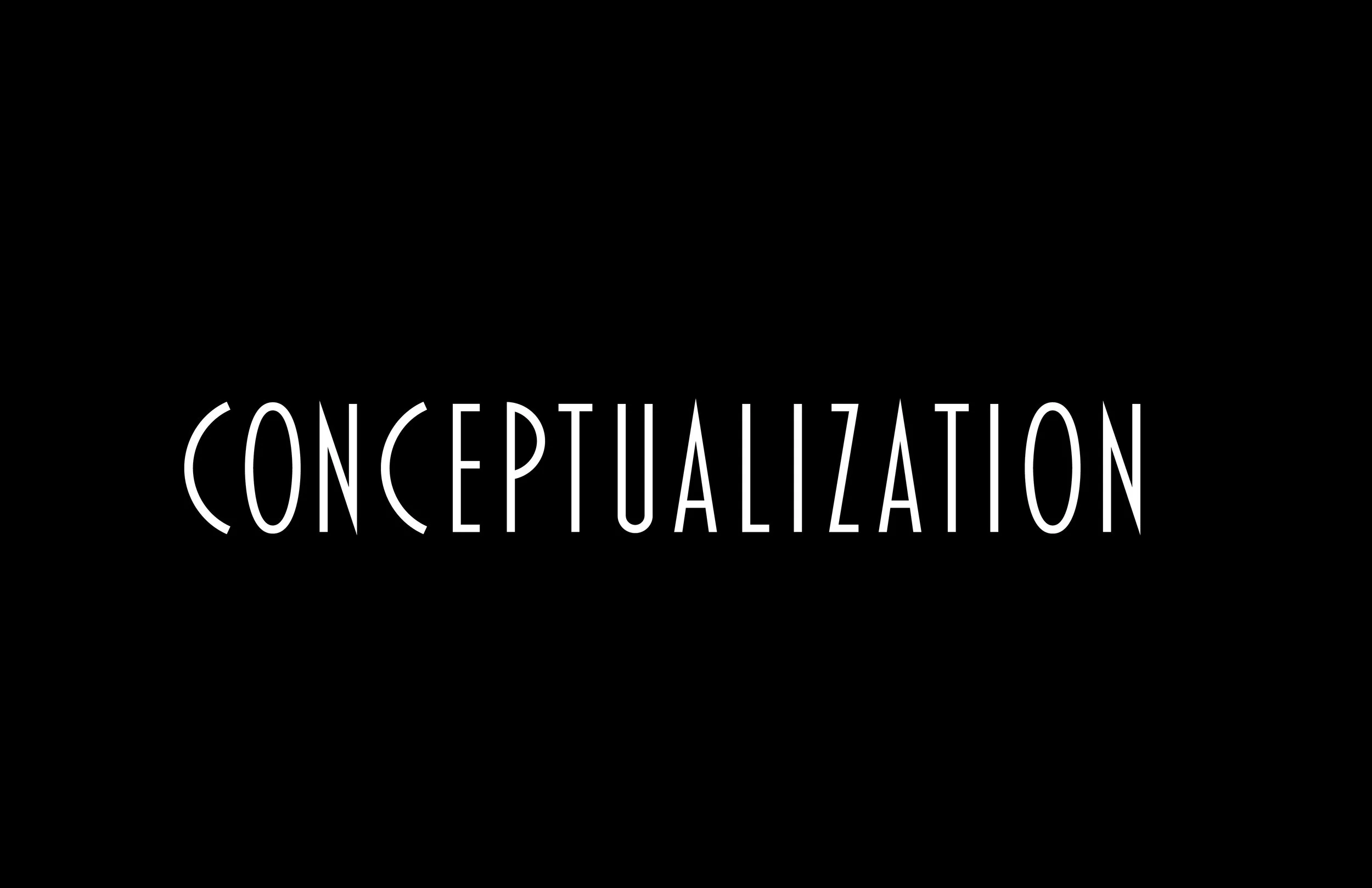
key typographic elements of the silent film genre.
old style serif as their display typeface
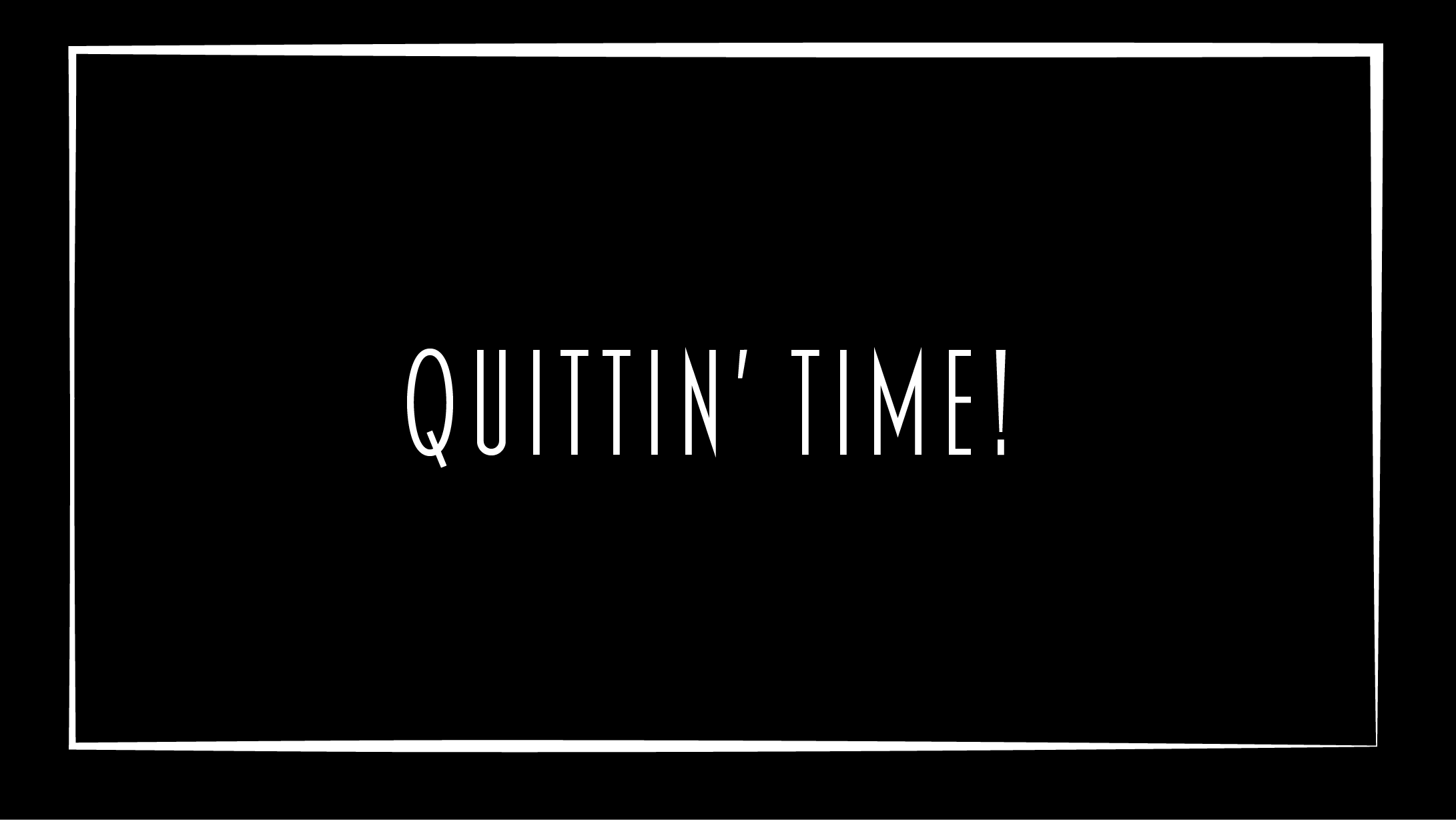
white descriptive type over a black background for frames that would have dialogue in a typical film.

dramatic and satyrical movements
subtle sped-up in physical actions such as walking and running motions
heavy emphasis on traditional slapstick comedy.
Point of View
The owner’s perspective is in third person, while Tito’s is in first person.
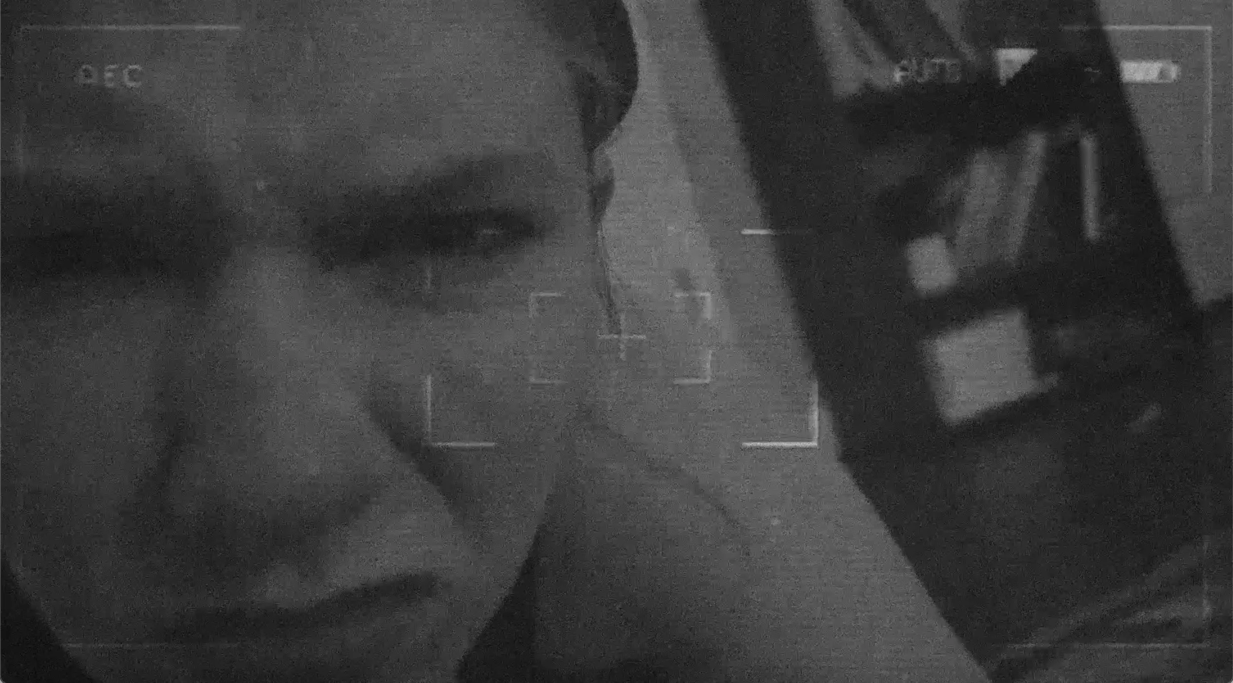
Tito’s perspective is through the lenses of a video camera, it needed to be apparent that it was stylistically different than the owner’s perspective.
Effects
Grain/Noise
To create a further distinction between the owner’s perspective and Tito’s perspective, I added 30% noise to the frames to his perspective.
Vingette
Due to the lower amount of frames used to shoot the 1920’s films, there is a flickering effect on the pieces. To achieve this, I overlaid vignette background with occasional flickering atop my frames.
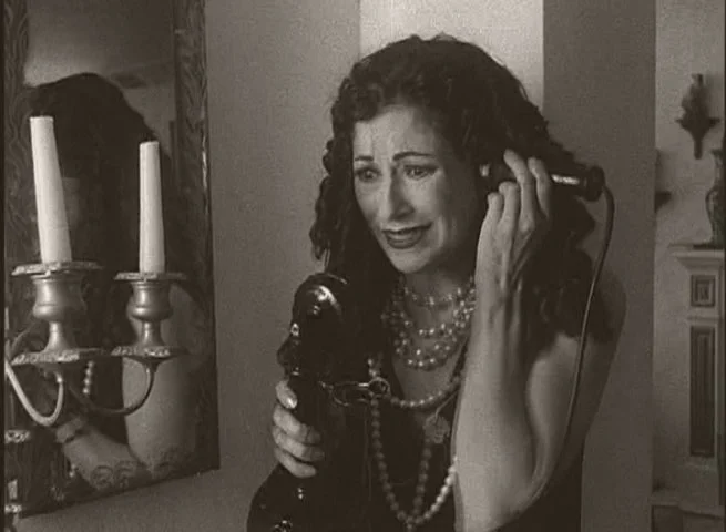
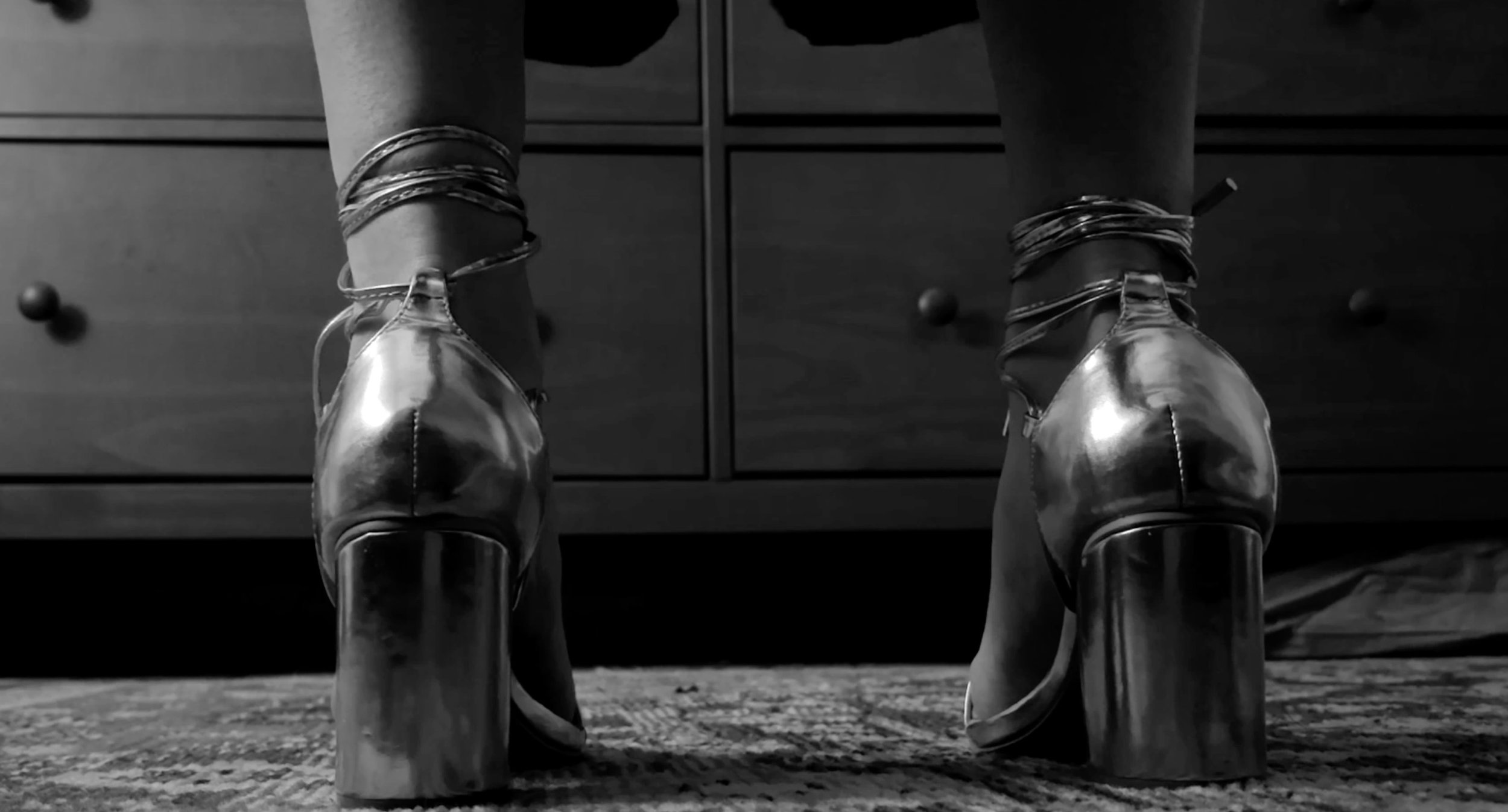
Black/White Color Correction
Since almost all silent films in the 1920’s were filmed in black and white, I used an adjustment layer to create a black/white effect on my entire film.
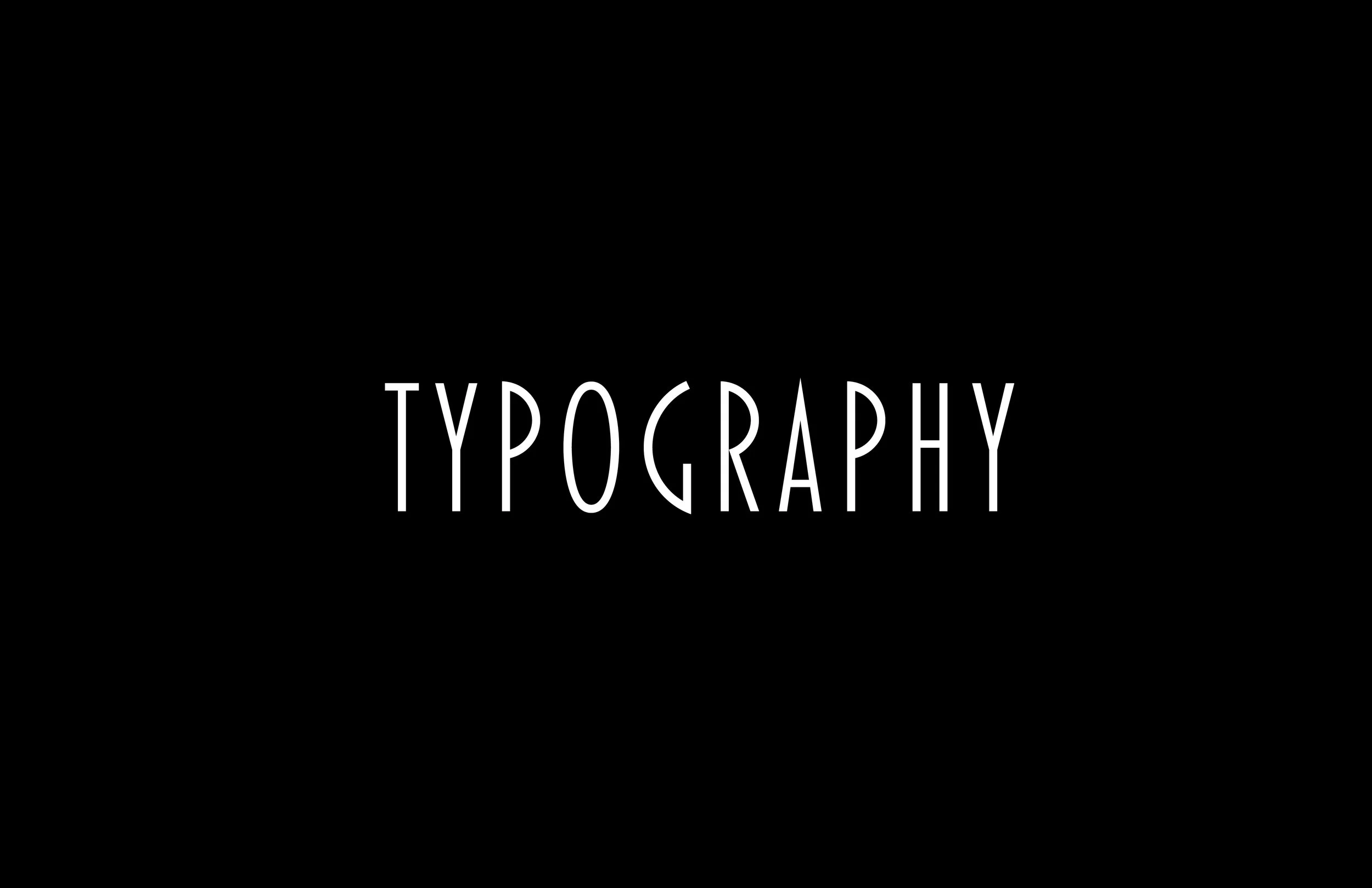
Markers of this typography include geometric lines, sharp angles, and simplified ornate designs.
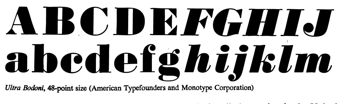
I chose Blakely Light for my body copy text, and hand-illustrated a title typeface based on a type specimen of Ultra Bodoni found in the Special Collections Library at the University of Georgia.